Branding, Set deign, Motion, Visual identity
WEBSITE
Turandot Opera
Puccini's final opera, reimagined for an audience that hasn't discovered it yet.
Opera has a perception problem. It's seen as inaccessible, intimidating, and not for everyone, which is a shame, because Turandot is one of the most dramatic, emotionally charged stories ever put on a stage. This academic project asked a genuinely interesting question: what would Puccini's final opera look like if it were designed for a generation that's never been to the opera? The answer required thinking across every touchpoint, identity, print, posters, brochure, tickets, set design, motion, and social media, as a single, unified creative direction.

The visual language of classical opera tends to reinforce its own exclusivity, dark, ornate, and self-serious in a way that signals "this isn't for you" to anyone who didn't grow up with it. Turandot in particular, set in mythic ancient China and built around themes of power, obsession, and redemption, risks feeling cold and remote if the design leans too heavily into its grandeur. The challenge was to open it up without dumbing it down, to make the drama feel immediate and human without losing the epic scale that makes it extraordinary.

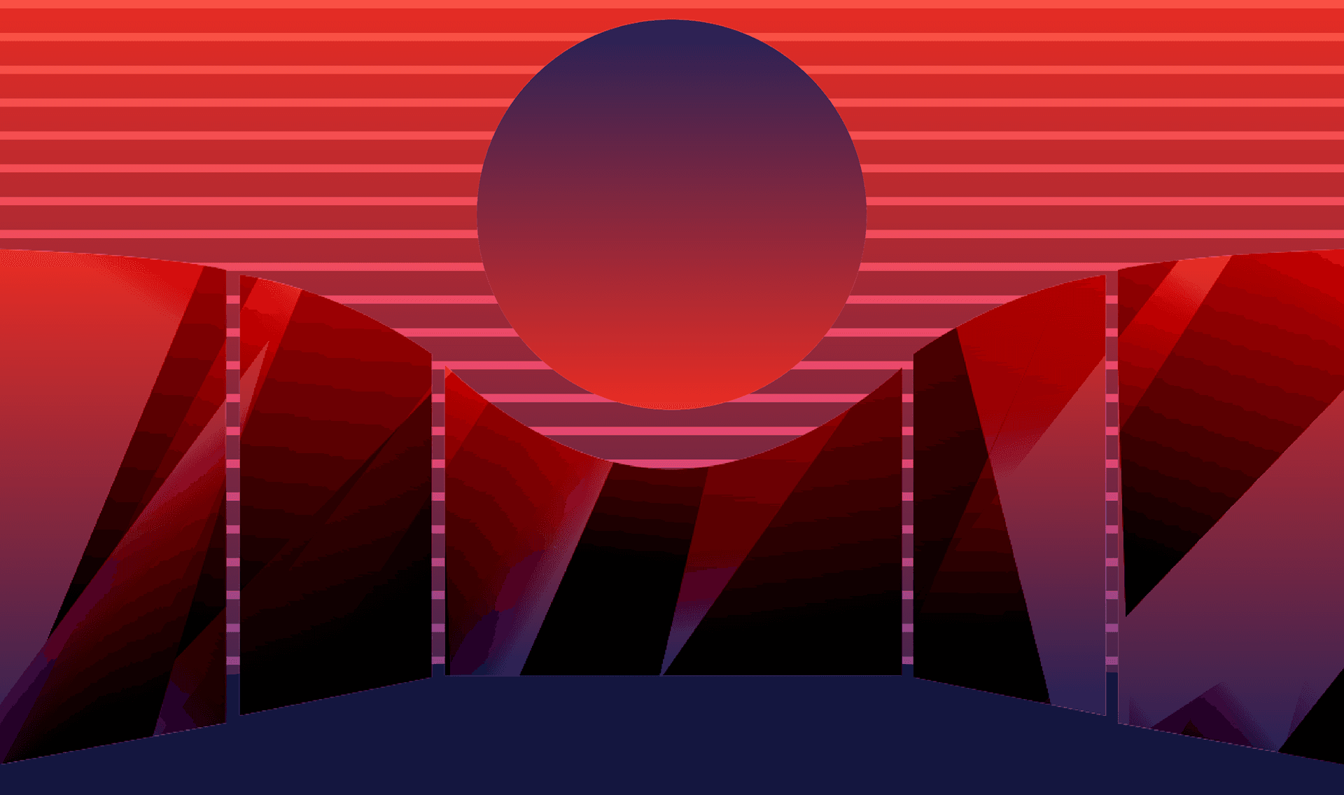
I developed a complete creative direction for the production, spanning visual identity, poster campaigns, brochure design, ticketing, set design, motion graphics, vinyl, and social media. The visual language is built on contrast: geometric structure against fluid form, sharp edges against sweeping gradients, deep blacks against vivid golds and reds. Bold, expressive typography carries the emotional weight of the story, while the graphic system scales from an intimate ticket stub to a full stage set without losing coherence. The set design translates the same visual language into three-dimensional space, making the identity something the audience doesn't just see in marketing, but stands inside.

The central idea is regal drama, a phrase that captures both Turandot's character and the design's intent. She is cold, powerful, and ultimately transformed. The design holds that tension throughout: control and emotion, structure and feeling, ancient and contemporary. The goal was to create a visual world so coherent and immersive that a first-time opera-goer would understand the emotional stakes of the story before the curtain even rose.
This was an academic exploration project completed in Florence, Italy. All concepts are original and created independently.


SET DESIGN