Brand Strategy, Brand Identity, Packaging Design
WEBSITE
www.subracoffee.com
Turning an unfamiliar ritual into the most confident coffee on the US shelf.
Melissa and Dhruv came to me with Subra: South Indian filter coffee, built for a US market that had never encountered the category. There was no local playbook to borrow from and no shelf precedent to lean on, just a strong point of view on what the brand shouldn't be. The challenge was to build an identity confident enough to introduce a new ritual without explaining it to death, and warm enough to earn trust on first glance.

South Indian filter coffee has a devoted following, but almost no presence on US shelves; there was no existing visual language for the category to react to or build on. The founders were also clear about what they didn't want: a soft, heritage-brand story leaning on nostalgia to do the selling. That ruled out the easiest path most new-category brands take, and left the identity to do the harder work of building trust through confidence rather than familiarity.

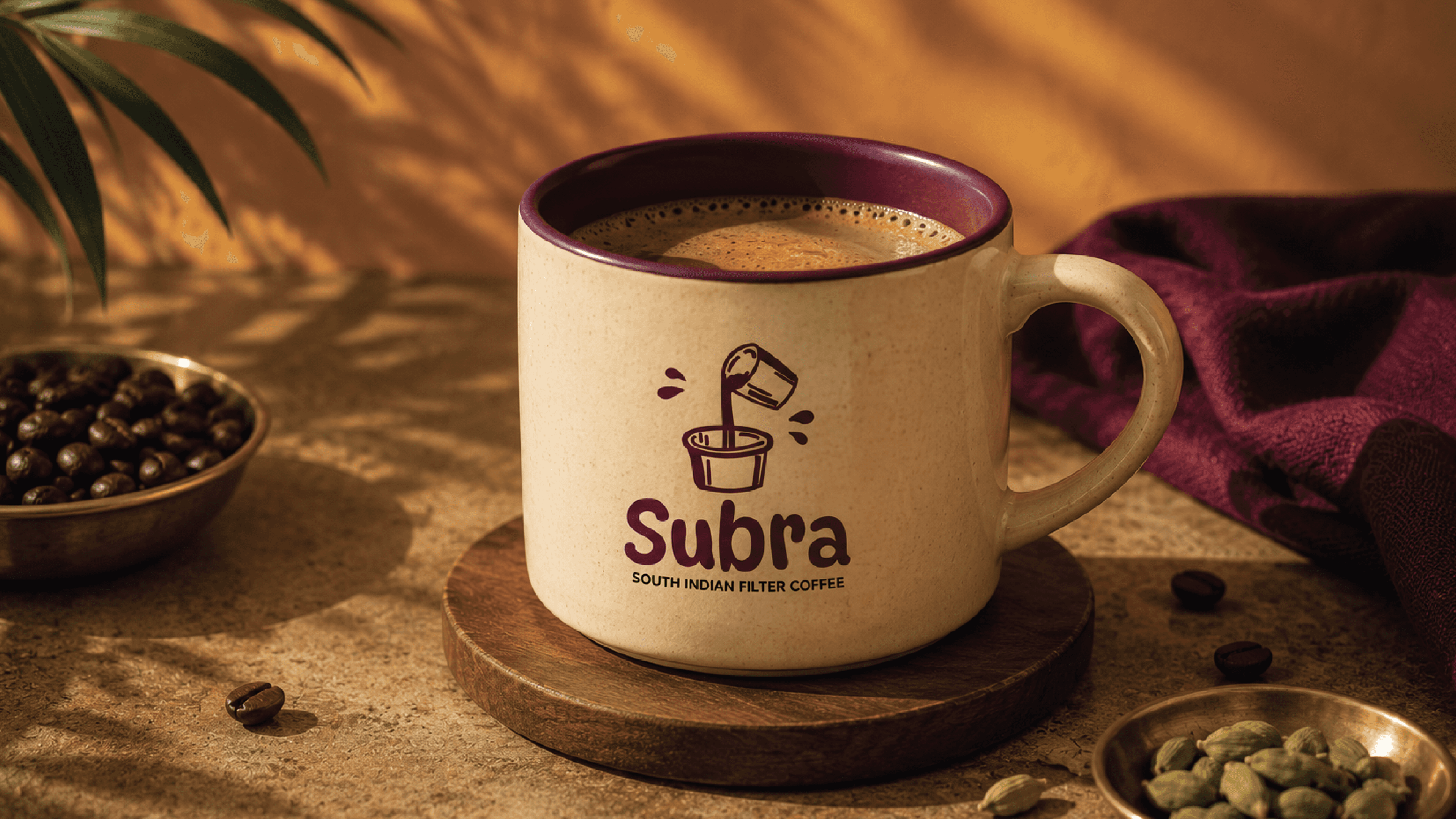
I built the identity around a single tension: "You've walked past it for years. We're the twist nobody saw coming." Early logo explorations used a full-color illustration of the traditional dabara-and-tumbler pour, but four competing colors flattened the hand-drawn quality into something closer to clip art. I simplified it to a single-color line-art mark set against one bold ground instead, easier to license consistently across packaging and digital, and it gave the palette room to actually read as confident rather than busy.

The palette centers on two colors doing different jobs. Mustard carries the weight of the system, the dominant ground the mark sits on, energetic without tipping into loud. Plum is reserved for the mark itself and for moments that need to feel deliberate, giving the identity one sharp point of contrast rather than several colors competing for attention. That restraint carries into typography too: a hand-lettered display face for headline moments, paired with a plain, highly legible sans for everything functional. Together, the system reads as a "friendly dare", bold enough to make a claim, warm enough to be believed.
The identity system, mark, palette, typography, and voice is now carrying through a full packaging rollout: two ground-coffee bag SKUs and two wraparound bottle labels for a cold-brew decoction line, currently in production prep.